... And it's actually much worse than that. (I replaced his shell mobile with his beautiful owl mobile since the picture was taken which doesn't work at all in the room's current state, but now the room is a huge mess because - like I've said before- I don't take care of my "undone" rooms... It gets so messy because I never want to spend any time in here. bad mama) I did put up shades to keep the un out at naptime...
I was really floundering with this room. We didn't know if we were having a boy or a girl so I decided to go with a general theme of owls & some fun colors and kind of a pale nature/ tree feeling... I planned to do the room once the baby came because I just couldn't get into it but had a general idea that it would be soft & pale & realxing. Dave painted the walls in a soft pretty cream. I bought a few great accessories:
... And waited for little one to arrive. When it was a HE and not a SHE, I really found that the direction I was going in just didn't appeal to me anymore. I forgot about the space for a month in the midst of new baby busyness. After he was a month old, I started saying to Dave, "We really need to do his nursery." It's taken another month for me to actually get around to designing it. But better late than never I guess. (In all honesty, I know the nursery at this point is more for my hapiness than Justin's... kids are fine anywhere when they're this tiny...ALthough I must say he LOVES his owl mobile and that thing is a Godsend.)
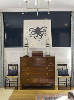
BUT I'm going in a really different direction. The owls will stay but I'm going a little nutty in here. I want it to have sort of a vintage, unexpected, Alice-in-Wonderlandy-curiosity-vibe. I want it to be darker and higher-contrast so baby Justin has lots to lay his little eyes on. The furniture we had was fron our old house & just doesn't fit well in here so I'm also reworking the shelving to fit this space. And finally, we've got some beautiful vintage lighting from our old house that I can't wait to get installed!!
So this weekend we're repainting and I'm ordering fabrics- finally!!! Here are some hints:
Don't be scurred.
Have an awesome weekend!!
xoxo,
lauren
*images from last sequence: Domino via Windlost, Domino, Markham Roberts via Cote de Texas, Grant K Gibson, Elle Decor Magazine cover, Apartment Therapy


0 comments:
Post a Comment