Today for out Guest Blogger Series, please welcome super-stylish Paloma of the beautiful blog La Dolce Vita!
{After: Our Guest Bathroom}
I was so excited when Lauren invited me to share a before and after on her wonderful blog, though I must admit, I was a bit intimidated. After all, Lauren is the queen of fabulous DIY projects! I don’t know how she manages to do it all, but she does so beautifully and with grace and kindness.
My before and after is of my guest bathroom which after a few very simple steps, was transformed from drab and predictable to something my husband and I absolutely love!
{Before: The Guest Bathroom circa 2007}
The guest bathroom featured a plain, white shower curtain, the requisite blue and brown combination that everyone was doing, and the original walnut cabinets. Looking at this makes me cringe now. The paint color (Benjamin Moore’s Plymouth Rock) is about all that remains.
I had spotted this shower curtain at Target, which reminded me of Kate Spade’s which was featured in Domino a few years ago. I sort of built my vision around it and got to work. I love the look of the curtain with the framed fan coral and monogrammed towels.
{Kate Spade’s Shower Curtains}
{The $30 Target Version}
I have always been partial to the look of white linens, so I ordered these towels from Pottery Barn and had them monogrammed. While I love the look of white towels, they are not always practical, so the linen closet is filled with graphite-colored Cynthia Rowley towels for guests to use when they visit. You’ll notice the hand towels are also graphite. I thought it was a nice, coordinating color.
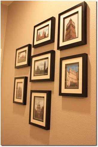
We completed this project right before Christmas. In September 2009, we traveled to London and in the summer of 2008, I traveled to Spain. I took some of my favorite shots from both trips, framed them, and hung them in the bathroom to add some interest. I chose to print the pictures in color. I thought that having black and white photos would just be too much in a predominantly black and white room.
On the Vanity: A Potted Orchid, Handmade Mexican Pewter Towel Ring, Archipelago Botanicals Diffuser, and a little Japanese bowl from Anthropologie.
The greatest impact came from painting the cabinets gloss black. We couldn’t spend the money for a new countertop and sink, so a little can of paint gave us a lot of bang for our buck! It created contrast between the cabinets and the counter which just wasn’t there with the original walnut cabinetry. If you look at the first two images in this post, you’ll notice the difference is huge!
We contemplated getting a new mirror for a while and a few weeks ago, I suggested that we buy some plain wood trim from Home Depot and paint it gloss black to match the cabinetry. Again, I think this choice made a tremendous impact and really completed the project. Not bad for a project that cost about $15.
I’d say the overall transformation of our guest bathroom cost about $300 and we are very pleased with the difference it has made. Thanks again for featuring my before and after, Lauren!
______________________________________________________
Paloma- What a huge difference the simple changes made- it's fresh, up-to-date & graphic & very "you!" I love the huge monograms on the towels and the black touches throughout. Painting the vanity really made the space feel so much bigger & prettier. (And all for only $300?!! awesome.) Thank you so much for sharing your guest bath transformation with us!!!
xoxo,
lauren


0 comments:
Post a Comment