This cottage has been in my family since the 50s. We've been been making memories here through now 4 generations. I remember coming here as a little girl and the whole family piling into the cottage on summer weekends: Beds pushed together, laughing & talking late into the night to the hum of the window air conditioning units. This cottage was built in the 1930s and when my dad inherited it in the late 90s, he completely redid it. I've been there helping along the way & we've had our disagreements believe me, but most of the time, I win. I want to share with you one of my favorite finished spaces, the kids' bathroom. We started with nothing. There wasn't an original bathroom there, jusgt a small sitting room. My dad raised the roof on the original cottage and made room for a large bathroom. When I started on this space it was just rough- framing, sans-drywall.
{Little galvanized buckets hold kiddie washcloths and toys}
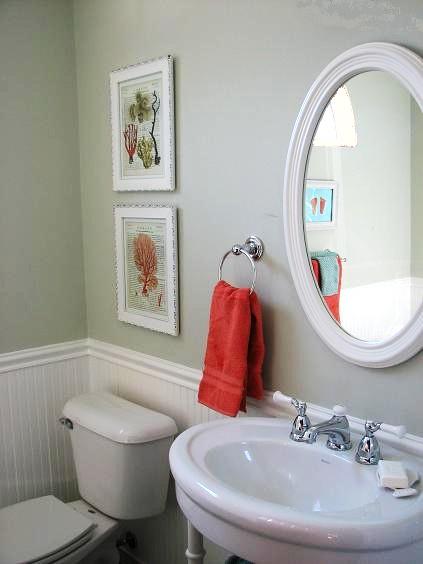
There are details that my dad has filled in that were not the ones specified by me (such as the wall color, chrome outlet covers, etc.) but I am seriously trying to LET GO. (It's not easy for someone like me..) I got to this bathroom in spurts on visits and so it's not exactly as I want it but it feels good, which is what matters most to me. I used fun bright colors- corals and aqua- to pull in the glass floor tiles and the scheme from the kids' bedroom.
A while back we made these little framed stamps of Christian's hands and feet:
I used the lobster print from the Natural Cuiosities centerfold:
{Still waiting to be properly matted}
And, finally, after years of waiting for the house to be finished, I got my dream last night:
The kids piled into the clawfoot tub!! (It's not original to the house, but a new 7 footer.) It was exactly as I'd envisioned and was seriously awesome. I'm sure many of you feel the same way about creating a space: you envision the way things will play out and "making memories" in the perfect setting. We'd had a nice long day at the lake and then it was easy & fun to just run the bath water in the massive tub and pile them in at the end of the day.
i loved seeing them having such a blast.
{Andrew, and poor Lily being squirted by Christian}
This is what it's all about and I just wanted to share with you. When we're creating rooms we really are doing more than designing spaces. We're affecting how we'll live. I love it!!
*Sink: American Standard
*Paint: "mountain haze" by Behr... Eventually, I'll switch it to a more bluey/aqua-gray instead of the green-gray it is (the current undertones are wrong with the aqua floor tiles) or a creamy-warm-beigey-neutral that works better with the glass floor (...My dad used the leftover paint from another room ;)


0 comments:
Post a Comment