Well, I finally took some photos of our finished kitchen. You've probably seen lots of of midstage pics, but I have to say, I've never been happier with the kitchen than I am now. If you remember back in April/ May, here's what it looked like before: maple arched cabinet doors, yummy flourescent light fixture, dirty linoleum...
 And here's what it looks like now:


 People have asked me about dust and we use almost everything up there all the time so it's not an issue, but for the occassional cake stand or seldom-used bowl, I simply rinse them out before using & it's honestly no big deal. And I love all of the things that I have up on the shelves that I've been given & have collected over the past few years. This way I get to see them all:
 I've shown you this before but it's my Grandma Maestranzi's colander:


We turned the little lost counter into a bar area by adding these wine racks from Pottery Barn and stocking the cabinets below with drinkware & drinks: 

Here's a bunch of our pretty wedding gifts that I love seeing displayed. People (the moms) used to be paranoid about us having our Waterford crystal out and bumpable & breakable, but to me it's one of those things that you just have to use & so what if some break? 

 Here's our little breakfast nook before:


 And here's what it looks like now:
We ripped down all of the uppers the first weekend we moved in & Dave put up beadboard & shelving. The whole thing was under $150 or so. We replaced the kitchen floors with click & lock Elm from Home Depot (read details here) at the same time we did the rest of the house. The cabinets are painted in Behr's "Witch Hazel" in semigloss. (For prep, I sanded them down with a hand sander, cleaned them & then just painted them with the semi-gloss.)

We added inexpensive nickel drawers pulls and knobs from Home Depot:

Now remember my appliance disasters??!! Well, the dishwasher from the Stone Age is back to being painted the same color as the cabinets. I used the exact same seim-gloss paint and did no prep for it. (I really recommend this if you have no money for new appliances... it just sort of recedes & your eyes doesn't really catch it at all..) It's nothing pretty to look at for sure, but it's better than the beige it was originally.

And thanks to you all I LOVE my fridge painted in chalkboard paint!!! I never would have thought of that on my own & after so many of you suggested it to me during the appliance diaster, I gave it a shot & I just love it!!!

It's a great spot for "to do" lists & pictures and the black works with the counters & shelf hardware. And, as you can see, Christian really loves it too:

I found the chandelier on the first flea market tour we took with Eddie & Jaithan. I debated & debated about buying it but walked away & Eddie offered to pick it up for me & mail it if I changed my mind. Well, a week or so later, I decided to go for it & Eddie & Jaithan were sweet enough to go back & buy it & mail it to us. Originally it was going to be for my dad's house but when we moved into our new place I knew the kitchen would be perfect for it! (I still have intentions of adding pretty wax drips on it but that's another day.)

As I've said before, I love having my shelves open: it makes my life easier. I can see everything at a glance & things are so easy to put away & grab.
 People have asked me about dust and we use almost everything up there all the time so it's not an issue, but for the occassional cake stand or seldom-used bowl, I simply rinse them out before using & it's honestly no big deal. And I love all of the things that I have up on the shelves that I've been given & have collected over the past few years. This way I get to see them all:
Everything on the shelves is either white, cream or silver. (usually aluminum or stainless) and I love the combination.
 I've shown you this before but it's my Grandma Maestranzi's colander:
thrift-store bust I painted white:

And I had to take a pic of the cakestand full of gorgeous cupcakes that my friends made for our Halloween party this weekend: yum yum!!

And you know how much soup we eat in this house so I just hung the silver ladle right on the wall between two nails next to the stove for easy-access:

And I also wanted to explain my decision on the black $3 Home Depot shelf brackets I chose for the shleving. I had received a comment or 2-- my dad being one of them :)--- in a previous post suggesting switching out my cheapie Home Depot brackets with pretty wooden brackets. And also to add moulding to the shelves & walls. And I do think that would be a beautiful kitchen, but my house is very simple & contemporary & clean-lined. As much as I love ornate woodwork, there's not really a place for it in my home. Antiques work, but I tend to go for clean-lined ones such as Gustavian or Shaker... I want to stay true to the architecture of the house & while we've made lots of changes, simple & straight is where I want things to be in this kitchen, so I'm actually really happy with them:

Below are a couple of other views of the kitchen 'before':


We turned the little lost counter into a bar area by adding these wine racks from Pottery Barn and stocking the cabinets below with drinkware & drinks:

The pic below makes me laugh because there's so much empty space in our wine racks. ahhahaha With me being pregnant, we're not really buying much wine so it'll be empty a bit longer:

Here's a bunch of our pretty wedding gifts that I love seeing displayed. People (the moms) used to be paranoid about us having our Waterford crystal out and bumpable & breakable, but to me it's one of those things that you just have to use & so what if some break?

We covered the doorway to our pantry with dropcloth curtains & it's great for hiding the organized mess that lives in there:

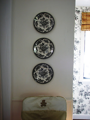
I found the plates at Lucketts! shocker. (but they work so well with my wallpaper!! :)
 Here's our little breakfast nook before:
And here is is now: wallpapered with a vintage saarinen reproduction table, thrift-store found Swedish chairs, smith + noble bamboo shades, and a chalkboard (oh yeah & Target booster seat! ;)--

We really love it & eat most meals here. I used a pair of Murray Feiss crystal sconces from our old house & painted them black so they'd work here... We so needed them to add some light to the space for nighttime meals. I got the wallpaper for a steal but unfortunately it's been discontinued. :( (I wanted more but oh well.)

Originally this was "the" chalkboard in our kitchen. (below) We probably seem chalkboard-crazed because now the fridge is also a chalkboard, but my originally intentions were to have one place for menus. I got these topiaries & am adding lots more rosemary into my meals lately because it's right there for the picking. One of the topiaries is fake.. (hee hee hee I know how bad fake plants are but it's a pretty good fake & seems to fool people since two of them are real.) So far the topiaries are still alive and I am so proud of myself!!!

As you can see, there are still a few things that will need to be upgraded some day, but for now I have the look & the feeling I wanted in my kitchen: it's both light & airy & a little cozy... It's a mix of old & new, food prep & clean-up are a breeze, and it's one of my favorite places to be in our house. (It also makes me want to add wallpaper to other rooms now!! :) Hope you enjoyed my too-many-photos-and-words tour!! ;)
xoxo,
lauren

0 comments:
Post a Comment